
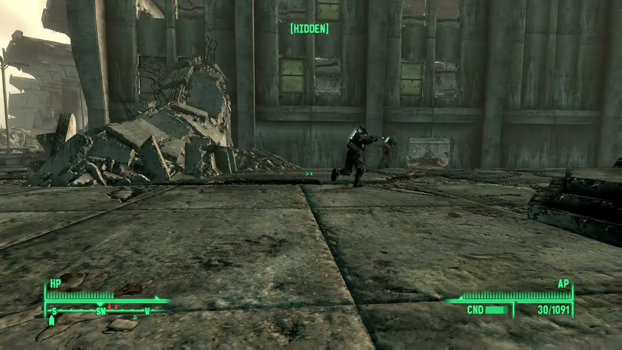
I have been playing my Playstation 3 again, as the disc reader in my Playstation 4 is not working and I have been unable to get a Playstation 5 yet. Recently I have been replaying Fallout 3 and Far Cry 3. I have been astonished how much better Far Cry 3 looks compared to Fallout 3. As I say this, keep in mind that I am not praising Ubisoft as a corporation or its protection of abusers. But Fary Cry 3 looks dramatically better than Fallout 3.

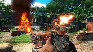
The reason is not the number of polygons or the high resolution either. The reason is color and composition. Fallout 3 is grey brown with a sickly green tinge (Fallout 4 fixed this issue while still looking appropriately worn down). Far Cry 3 is, like Fallout 3, a world built from scraps and garbage. But Far Cry 3 is a vibrant world. The grass is green and the sky is blue. The pirates all wear a prominent piece of red clothing to make them stand out from the green of the jungle and rusted iron of the outposts. The outposts themselves are build from scavenged materials, but they still have paint on them and still have color.


The world of Fallout 3 is a world of washed out low contrast. The world of Far Cry 3 is a world a high saturation worn out splendor. Both are worlds built from junk, but one is vibrant and alive, the other is dead. Now, a dead world is what Fallout 3 was going for, design wise, but it needs to be a dead world that is entertaining to interact with. Because they are both games first. Now, I love both games. But, I have played far more Far Cry 3 than Fallout 3. And I have played far more Fallout 4 that Fallout 3, and part of that is definitely because the world of Fallout 4 is more enjoyable to traverse, and nicer to experience. High resolution will not improve poor design. Better technology will not fix dull art.


One thought on “What the Eye Sees”